


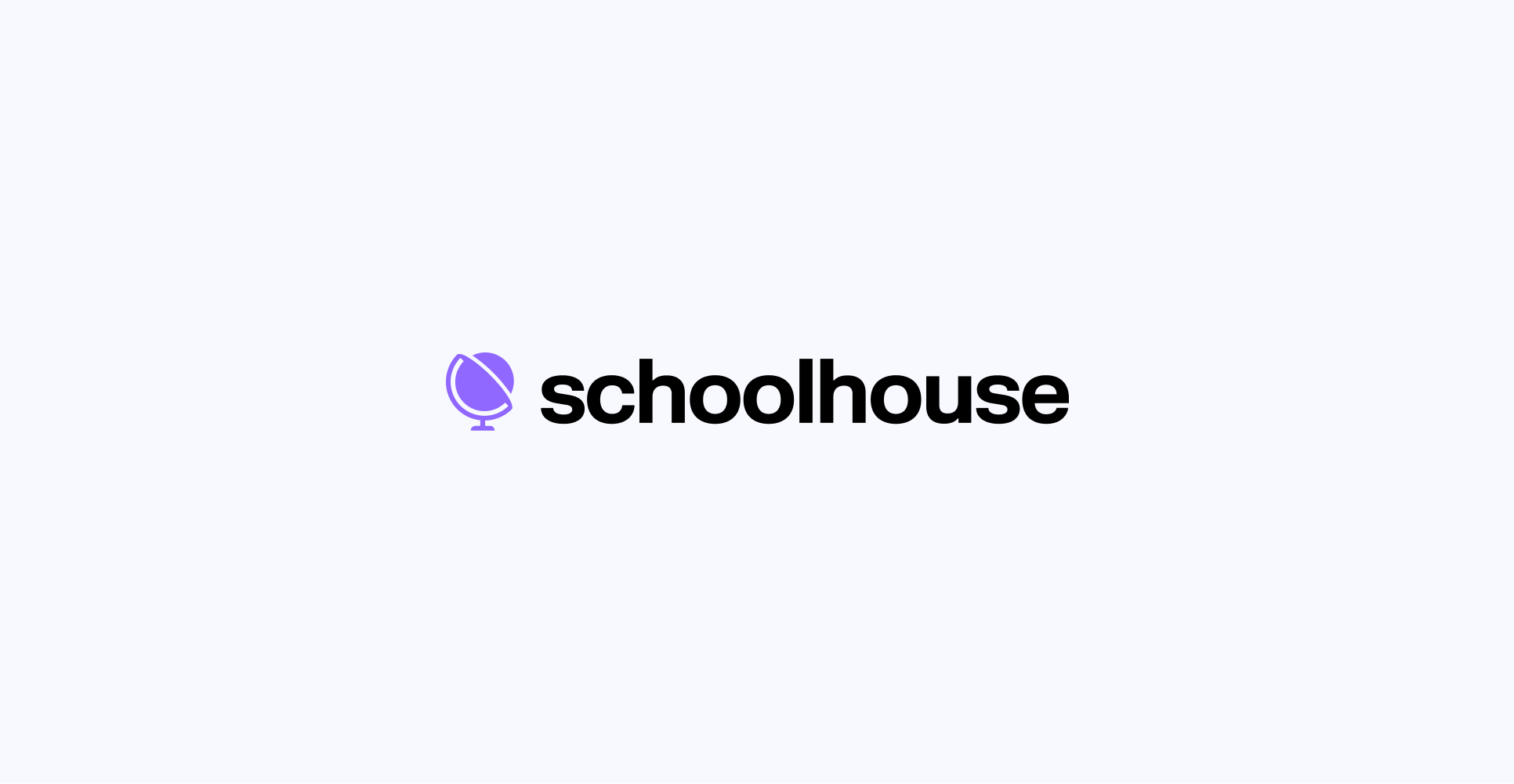
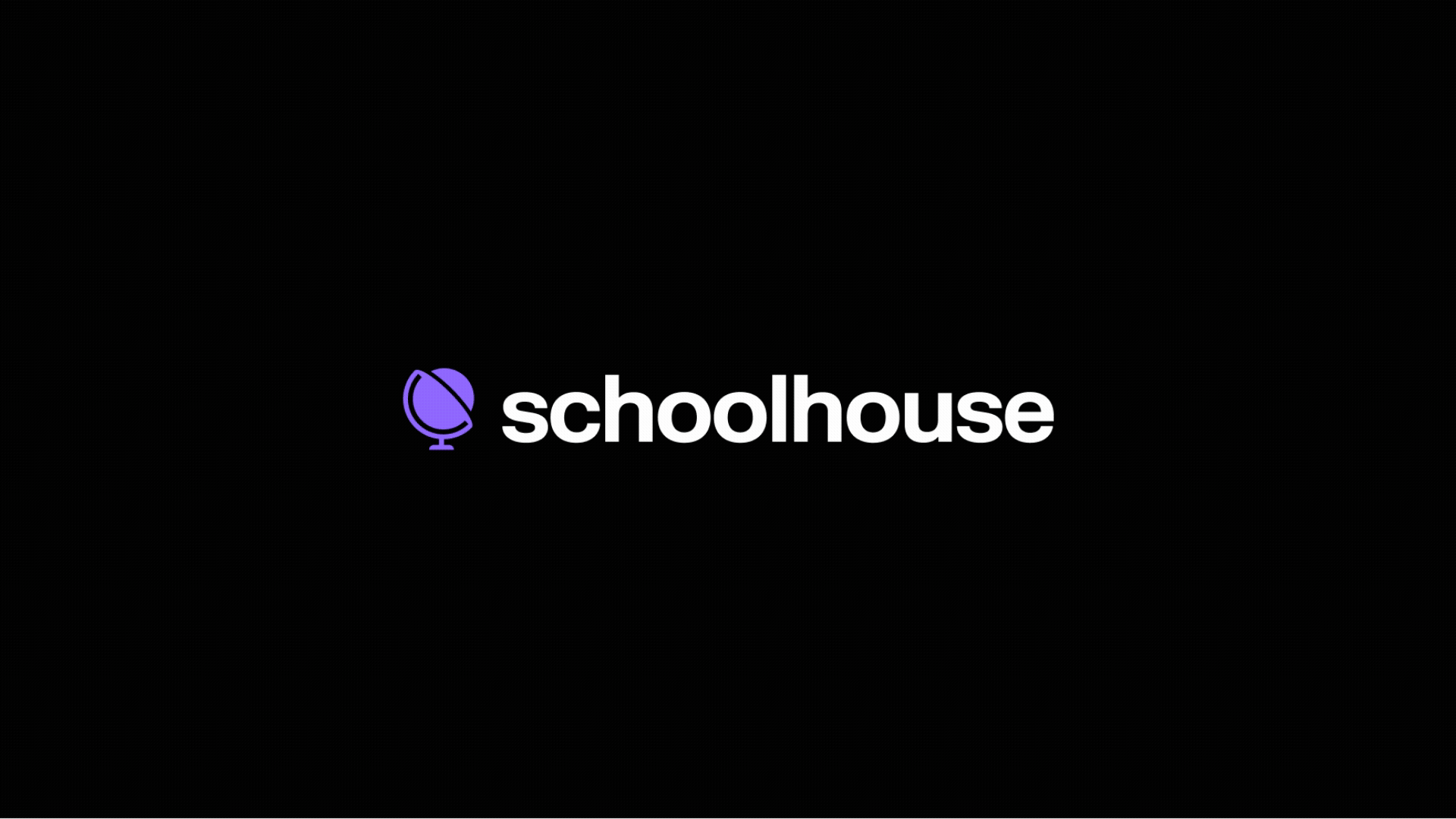
1a
Primary Lockup
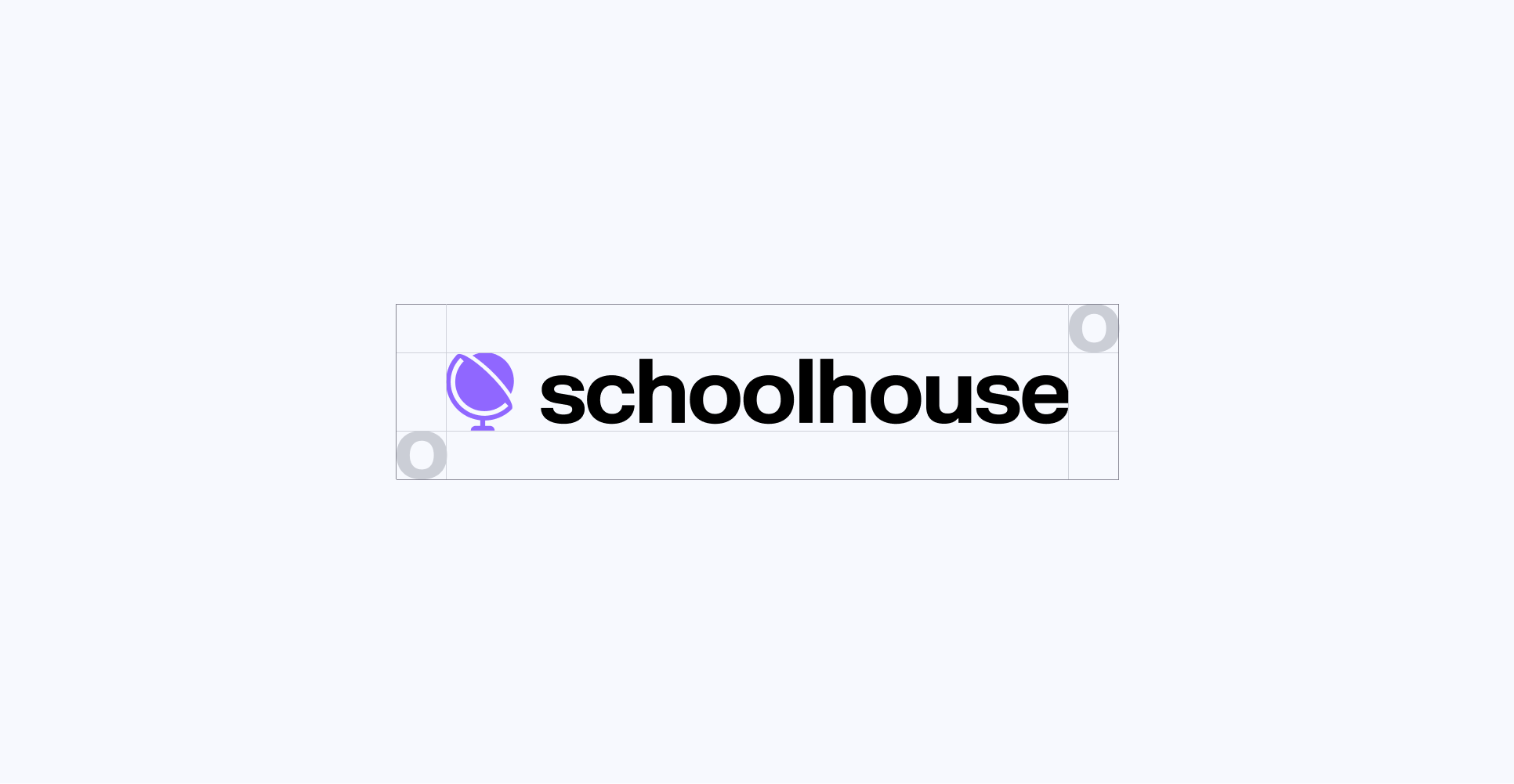
1b
Clearspace
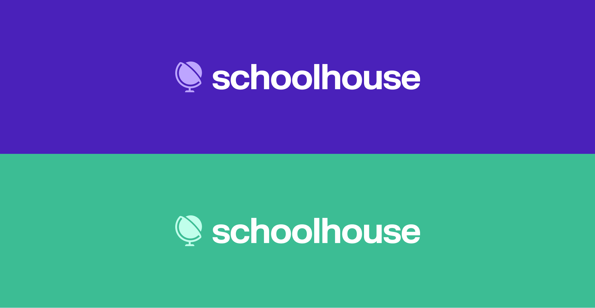
1c
Secondary Lockups

1d
Incorrect Usage
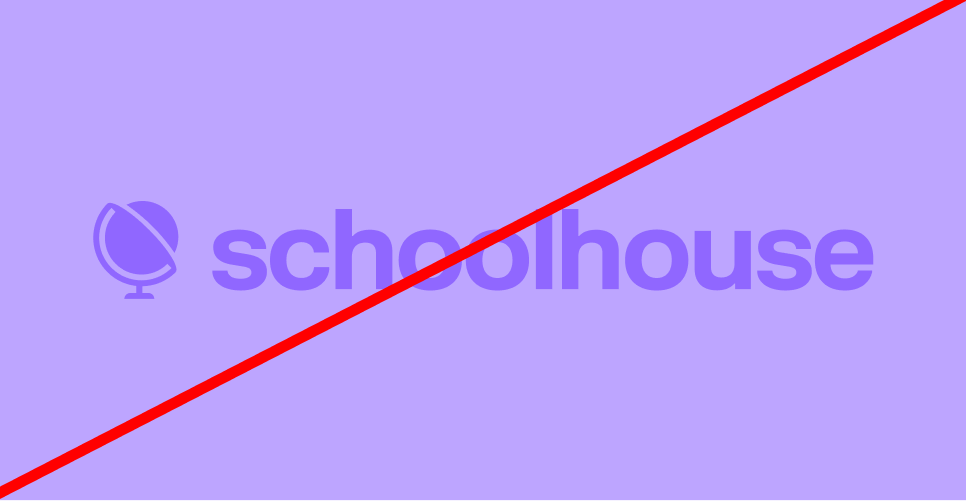

Avoid low contrast combinations
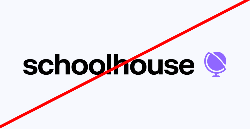
Do alter the order of the logo
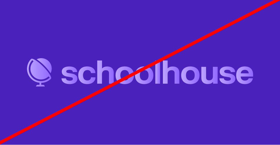
Don’t use gradients in the logo
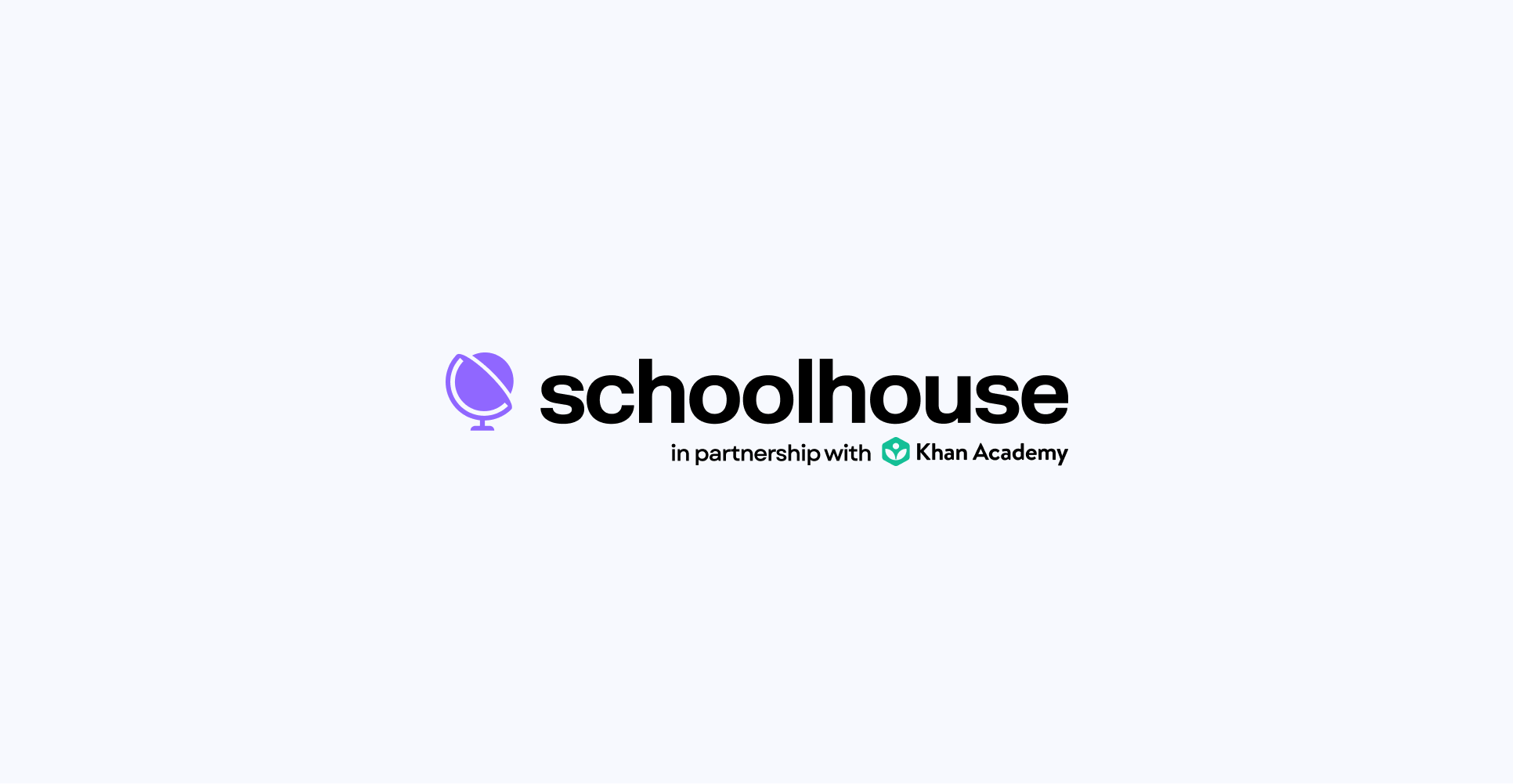
1e
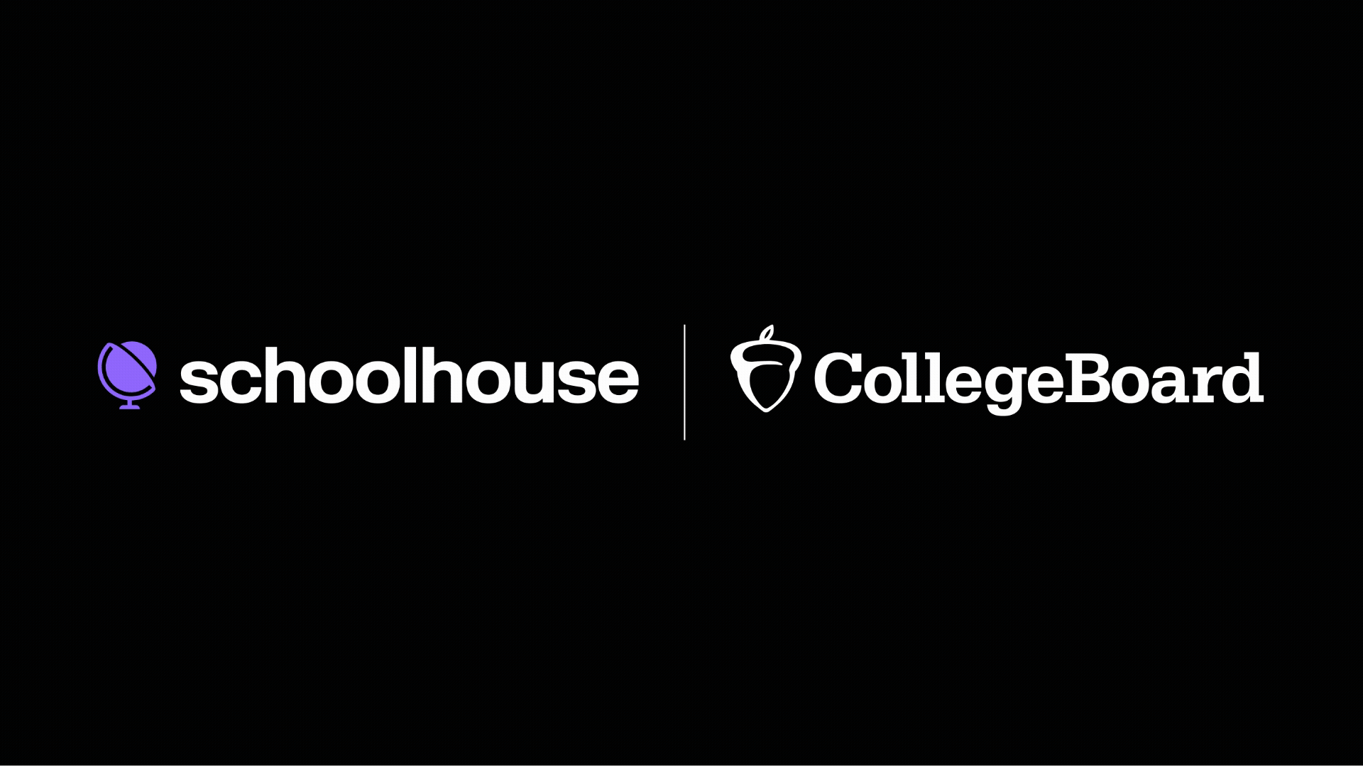
Partnerships
2a
Primary Palette
Orange
Hex: #9067FF
Purple 01
Hex: #4A21BA
Purple 03
Hex: #C6EBF7
Orange
Hex: #C0FFEB
Green 01
Hex: #3CBD94
Aqua 03
Hex: #C6EBF7
Orange
Hex: #54E082
Green 01
Hex: #1EA74B
Green 03
Hex: #C6EBF7
Black
Hex: #000000
Pure White
Hex: #FFFFFF
Off White
Hex: #F7F9FE
05
Typography
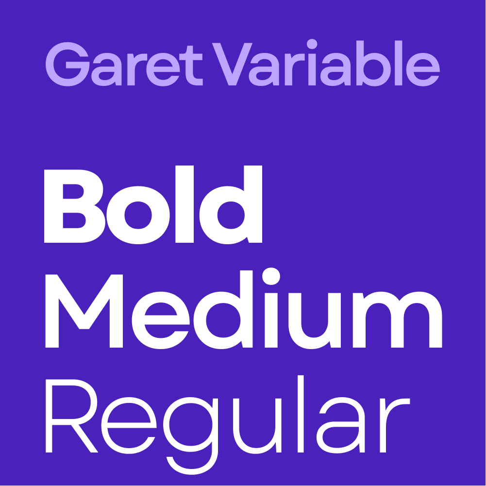
Schoolhouse uses the Garet Variable typeface to bring a bold, modern personality to its communications—geometric, clean, and confidently simple. With a friendly, human feel, Garet strikes a balance between approachability and clarity, making it ideal for both headlines and everyday content. Primarily using weights from Regular to Bold, the system offers flexibility to be expressive yet consistent—ensuring every message feels conversational and readable.
07
Photography
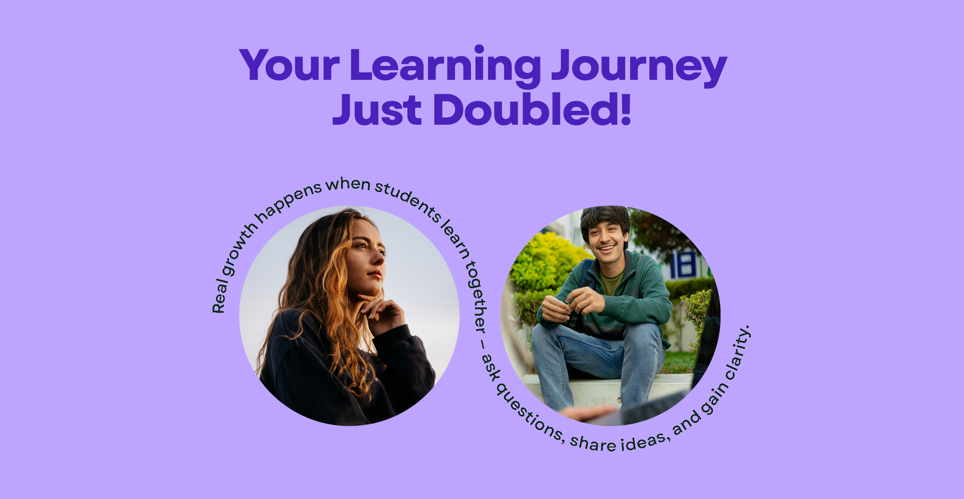
Schoolhouse photography should feel warm, candid, and human—celebrating real learning moments between real people. Whether capturing quiet focus or collaborative energy, our imagery supports a story of curiosity, connection, and confidence.

Clean & Casual
Photography should showcase naturally lit, inviting spaces that feel lived-in but uncluttered. The tone is casual and optimistic—ideal for capturing students in relaxed, authentic learning environments.

Moments of Connection
Images should highlight peer-to-peer relationships—students learning together, laughing, or working through a problem side-by-side. These shots emphasize collaboration and the emotional reward of shared progress.

Learning in Action
Capture storytelling moments that show curiosity and engagement—like note-taking, asking questions, or presenting an idea. These images convey energy, growth, and the everyday excitement of learning.

Personal Focus
Highlight individual students deep in thought, exploring topics at their own pace. These scenes reflect self-guided learning, personal empowerment, and the confidence that comes from understanding something new.
08
Putting it all together
09
Templates

Submit a Creative Request
Made with 💙 in Salt Lake City by Underbelly Creative.


Brand Guidelines
This guide captures the visual language that reflect what makes Schoolhouse unique: a peer-to-peer learning platform rooted in community, simplicity, and human connection. It’s designed to help everyone—from designers and writers to developers and partners—create a consistent, bold, and approachable experience across every touchpoint.
03
Logo
The Schoolhouse logo is a refreshed take on its original mark—simple, clear, and now with a bolder presence. This evolution stays true to its roots while reinforcing confidence and legitimacy.
The use of lowercase letterforms and clean geometry speaks to the platform’s peer-to-peer, community-driven spirit, while the updated weight adds clarity, impact, and a sense of momentum. It’s friendly, modern, and instantly recognizable.
1a
Primary Lockup
1b
Clearspace
1c
Secondary Lockups
1d
Incorrect Usage
Avoid low contrast combinations
Do alter the order of the logo
Don’t use gradients in the logo
1e
Partnerships
04
Color
The Schoolhouse color palette is bold, fresh, and approachable—mixing vibrant purples, greens, and aquas. These colors strike a balance between playful and trustworthy, helping the brand feel both friendly and legit. Designed for flexibility across digital and print, the palette brings clarity, consistency, and a sense of human connection to every touchpoint.
2a
Primary Palette
05
Typography
Schoolhouse uses the Garet Variable typeface to bring a bold, modern personality to its communications—geometric, clean, and confidently simple. With a friendly, human feel, Garet strikes a balance between approachability and clarity, making it ideal for both headlines and everyday content. Primarily using weights from Regular to Bold, the system offers flexibility to be expressive yet consistent—ensuring every message feels conversational and readable.
06
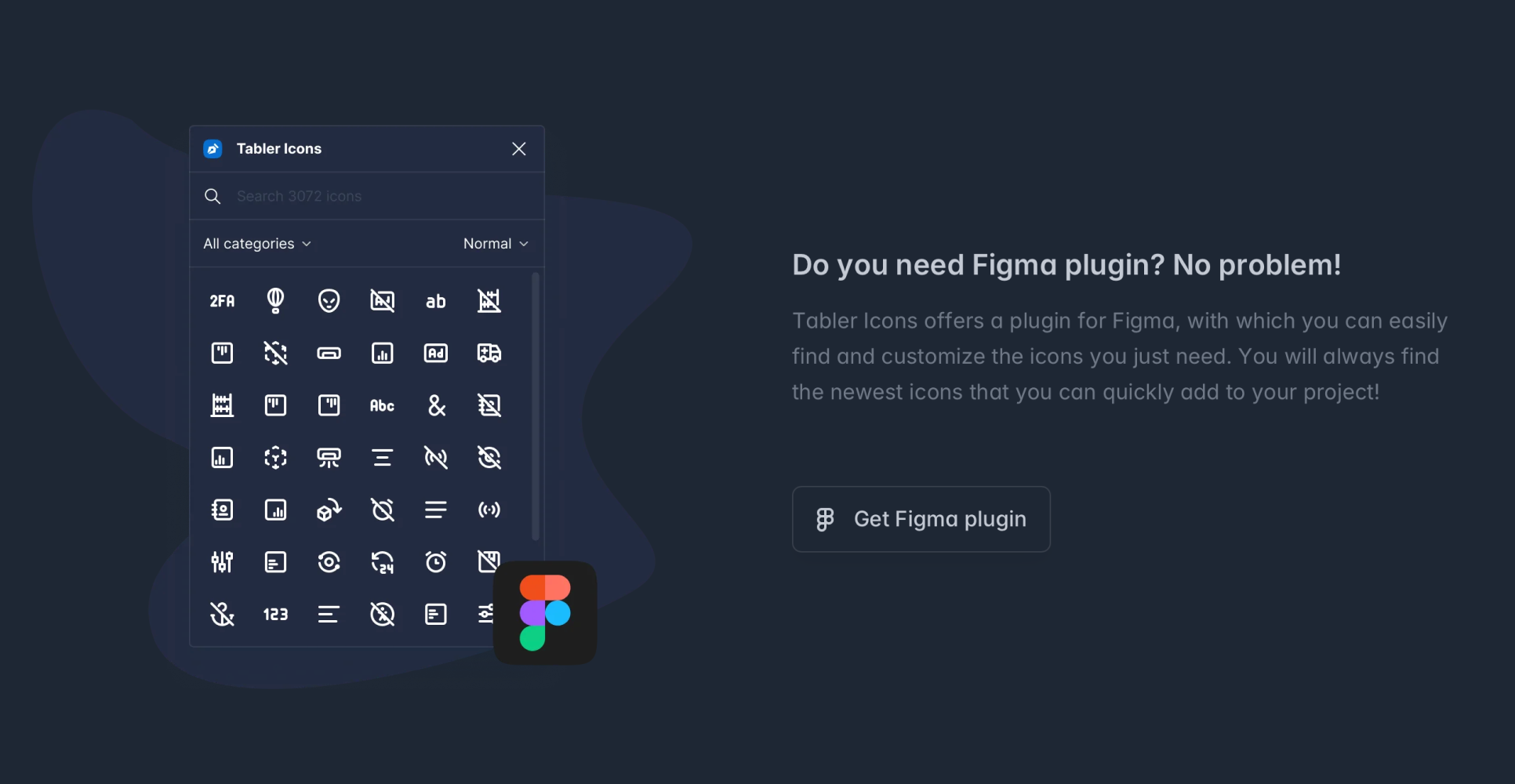
Iconography
We use Tabler Icons to bring clarity, simplicity, and a geometric balance to its visual language. With clean lines and a lightweight feel, these icons support the brand’s approachable and modern tone without overwhelming the message. They’re used sparingly and purposefully—to guide, clarify, and enhance—not decorate.
Download Tabler Here.
07
Photography
Schoolhouse photography should feel warm, candid, and human—celebrating real learning moments between real people. Whether capturing quiet focus or collaborative energy, our imagery supports a story of curiosity, connection, and confidence.
Clean & Casual
Photography should showcase naturally lit, inviting spaces that feel lived-in but uncluttered. The tone is casual and optimistic—ideal for capturing students in relaxed, authentic learning environments.
Moments of Connection
Images should highlight peer-to-peer relationships—students learning together, laughing, or working through a problem side-by-side. These shots emphasize collaboration and the emotional reward of shared progress.
Learning in Action
Capture storytelling moments that show curiosity and engagement—like note-taking, asking questions, or presenting an idea. These images convey energy, growth, and the everyday excitement of learning.
Personal Focus
Highlight individual students deep in thought, exploring topics at their own pace. These scenes reflect self-guided learning, personal empowerment, and the confidence that comes from understanding something new.
08
Putting it all together
When applied cohesively, the Schoolhouse brand elements come together to create a clear, energetic, and human-centered identity. Photography, layout, and language all reinforce the values of connection, clarity, and community—bringing the brand to life in a way that feels uniquely Schoolhouse.
09
Templates
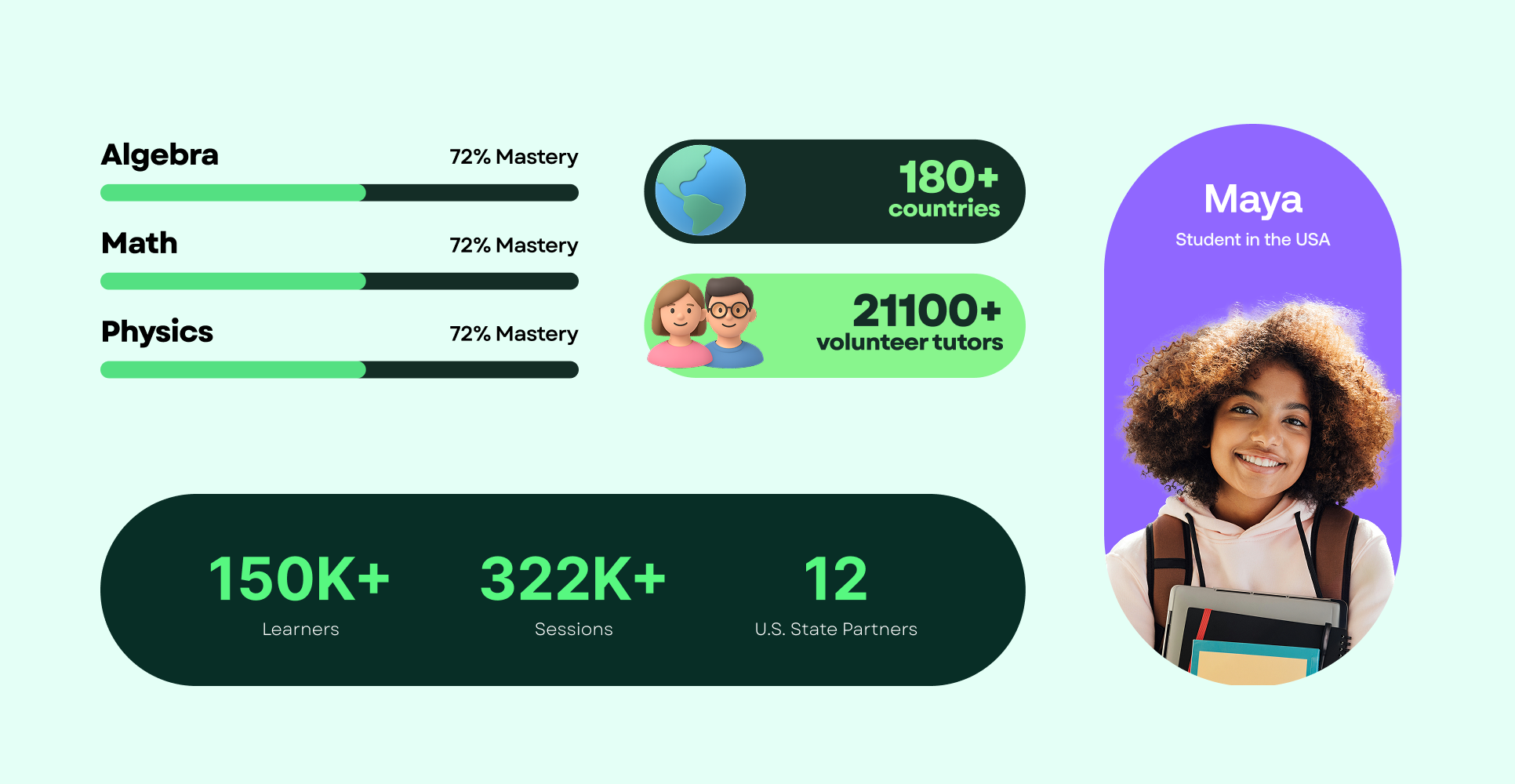
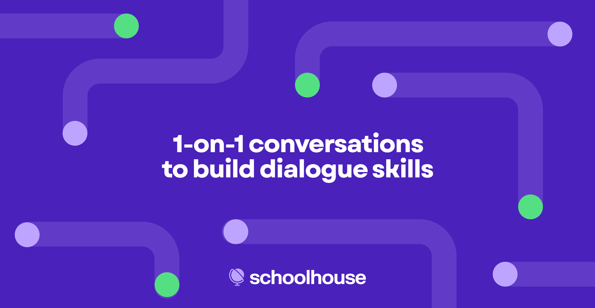
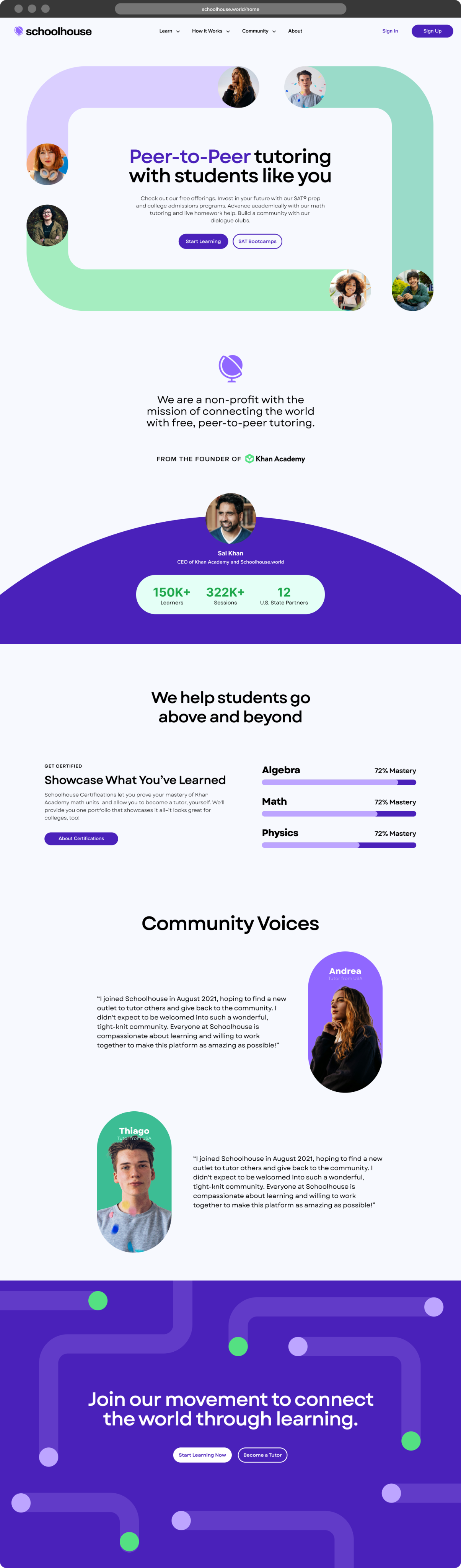
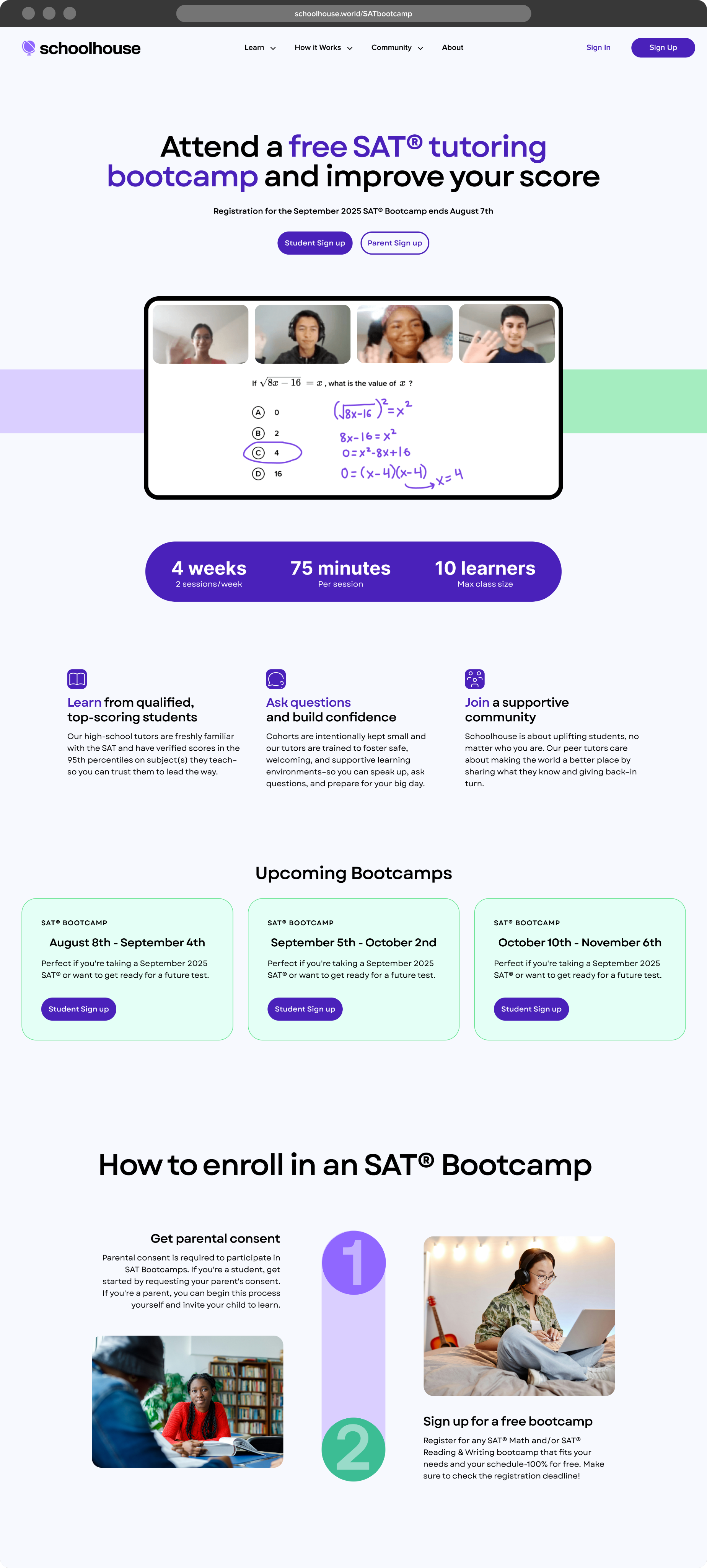
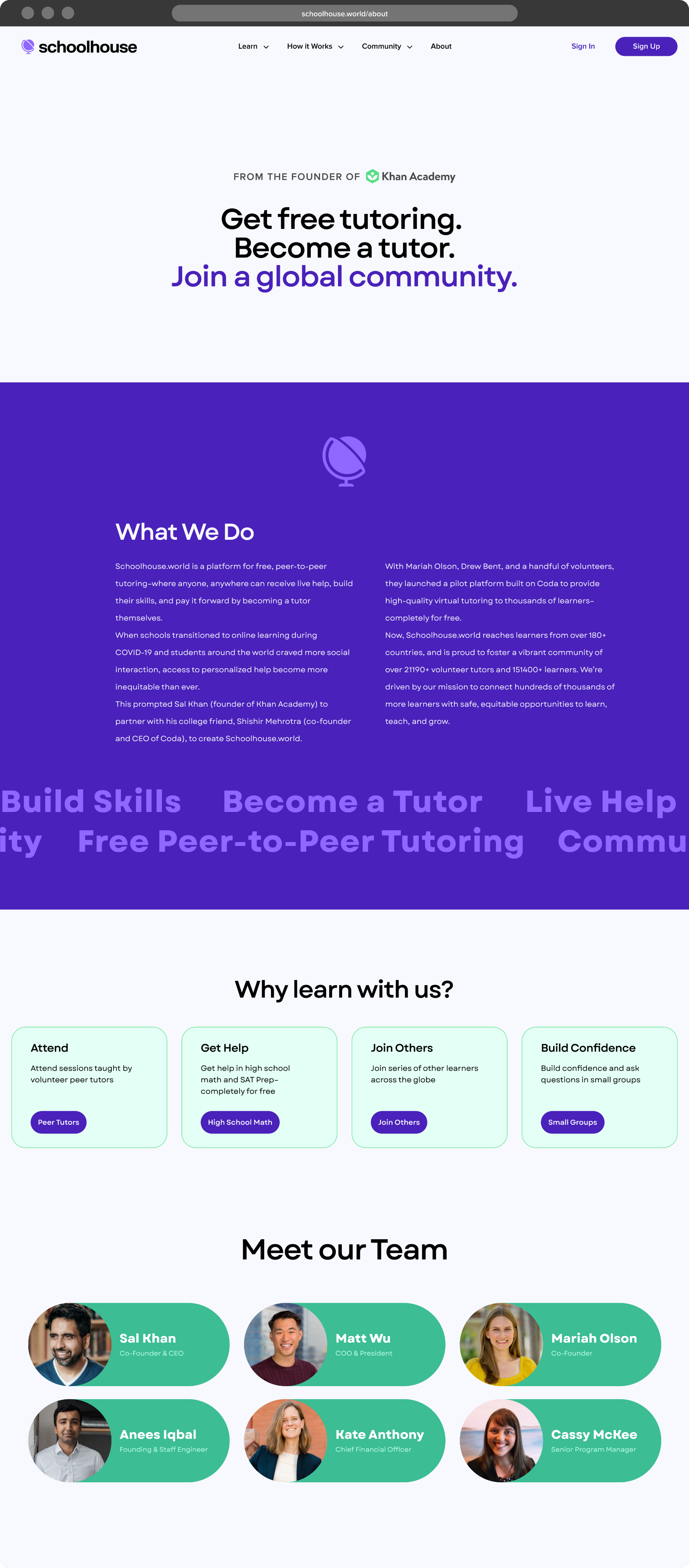
Our current set of templates is small but purposeful—starting with core website layouts that establish the foundation for a cohesive digital experience. These templates reflect Schoolhouse’s bold, clean, and community-driven identity, using consistent type, color, and structure to ensure clarity and connection at every touchpoint.

Submit a Creative Request
Made with 💙 in Salt Lake City by Underbelly Creative.
Back to the top
↑


Brand Guidelines
This guide captures the visual language that reflect what makes Schoolhouse unique: a peer-to-peer learning platform rooted in community, simplicity, and human connection. It’s designed to help everyone—from designers and writers to developers and partners—create a consistent, bold, and approachable experience across every touchpoint.
03
Logo
The Schoolhouse logo is a refreshed take on its original mark—simple, clear, and now with a bolder presence. This evolution stays true to its roots while reinforcing confidence and legitimacy.
The use of lowercase letterforms and clean geometry speaks to the platform’s peer-to-peer, community-driven spirit, while the updated weight adds clarity, impact, and a sense of momentum. It’s friendly, modern, and instantly recognizable.
1a
Primary Lockup
1b
Clearspace
1c
Secondary Lockups
1d
Incorrect Usage
Avoid low contrast combinations
Do alter the order of the logo
Don’t use gradients in the logo
1e
Partnerships
04
Color
The Schoolhouse color palette is bold, fresh, and approachable—mixing vibrant purples, greens, and aquas. These colors strike a balance between playful and trustworthy, helping the brand feel both friendly and legit. Designed for flexibility across digital and print, the palette brings clarity, consistency, and a sense of human connection to every touchpoint.
2a
Primary Palette
05
Typography
Schoolhouse uses the Garet Variable typeface to bring a bold, modern personality to its communications—geometric, clean, and confidently simple. With a friendly, human feel, Garet strikes a balance between approachability and clarity, making it ideal for both headlines and everyday content. Primarily using weights from Regular to Bold, the system offers flexibility to be expressive yet consistent—ensuring every message feels conversational and readable.
06
Iconography
We use Tabler Icons to bring clarity, simplicity, and a geometric balance to its visual language. With clean lines and a lightweight feel, these icons support the brand’s approachable and modern tone without overwhelming the message. They’re used sparingly and purposefully—to guide, clarify, and enhance—not decorate.
Download Tabler Here.
07
Photography
Schoolhouse photography should feel warm, candid, and human—celebrating real learning moments between real people. Whether capturing quiet focus or collaborative energy, our imagery supports a story of curiosity, connection, and confidence.
Clean & Casual
Photography should showcase naturally lit, inviting spaces that feel lived-in but uncluttered. The tone is casual and optimistic—ideal for capturing students in relaxed, authentic learning environments.
Moments of Connection
Images should highlight peer-to-peer relationships—students learning together, laughing, or working through a problem side-by-side. These shots emphasize collaboration and the emotional reward of shared progress.
Learning in Action
Capture storytelling moments that show curiosity and engagement—like note-taking, asking questions, or presenting an idea. These images convey energy, growth, and the everyday excitement of learning.
Personal Focus
Highlight individual students deep in thought, exploring topics at their own pace. These scenes reflect self-guided learning, personal empowerment, and the confidence that comes from understanding something new.
08
Putting it all together
When applied cohesively, the Schoolhouse brand elements come together to create a clear, energetic, and human-centered identity. Photography, layout, and language all reinforce the values of connection, clarity, and community—bringing the brand to life in a way that feels uniquely Schoolhouse.
09
Templates
Our current set of templates is small but purposeful—starting with core website layouts that establish the foundation for a cohesive digital experience. These templates reflect Schoolhouse’s bold, clean, and community-driven identity, using consistent type, color, and structure to ensure clarity and connection at every touchpoint.

Submit a Creative Request
Made with 💙 in Salt Lake City by Underbelly Creative.